2022
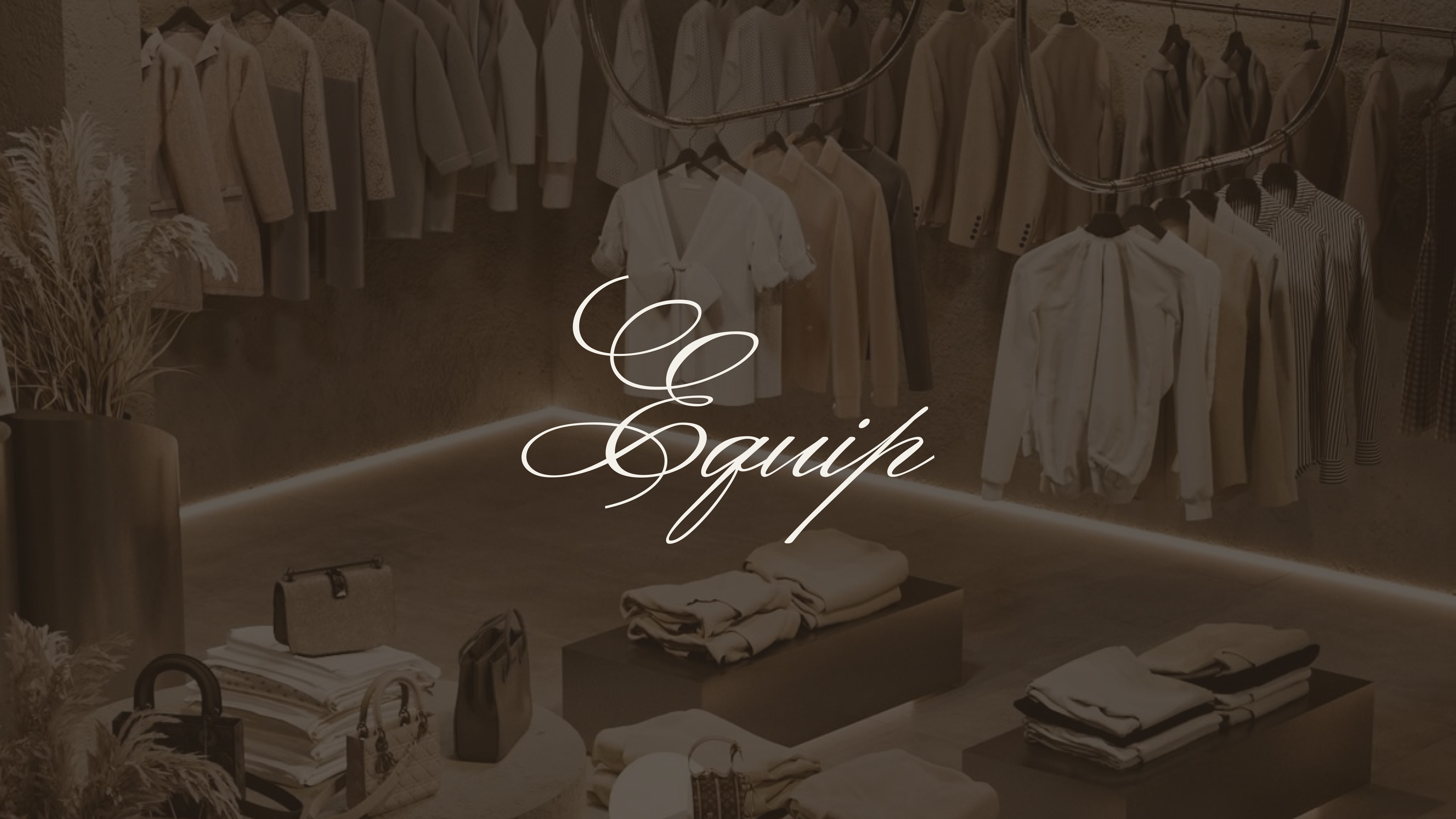
Equip
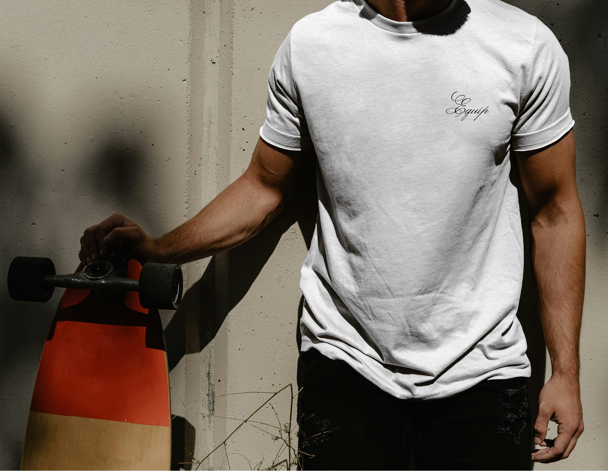
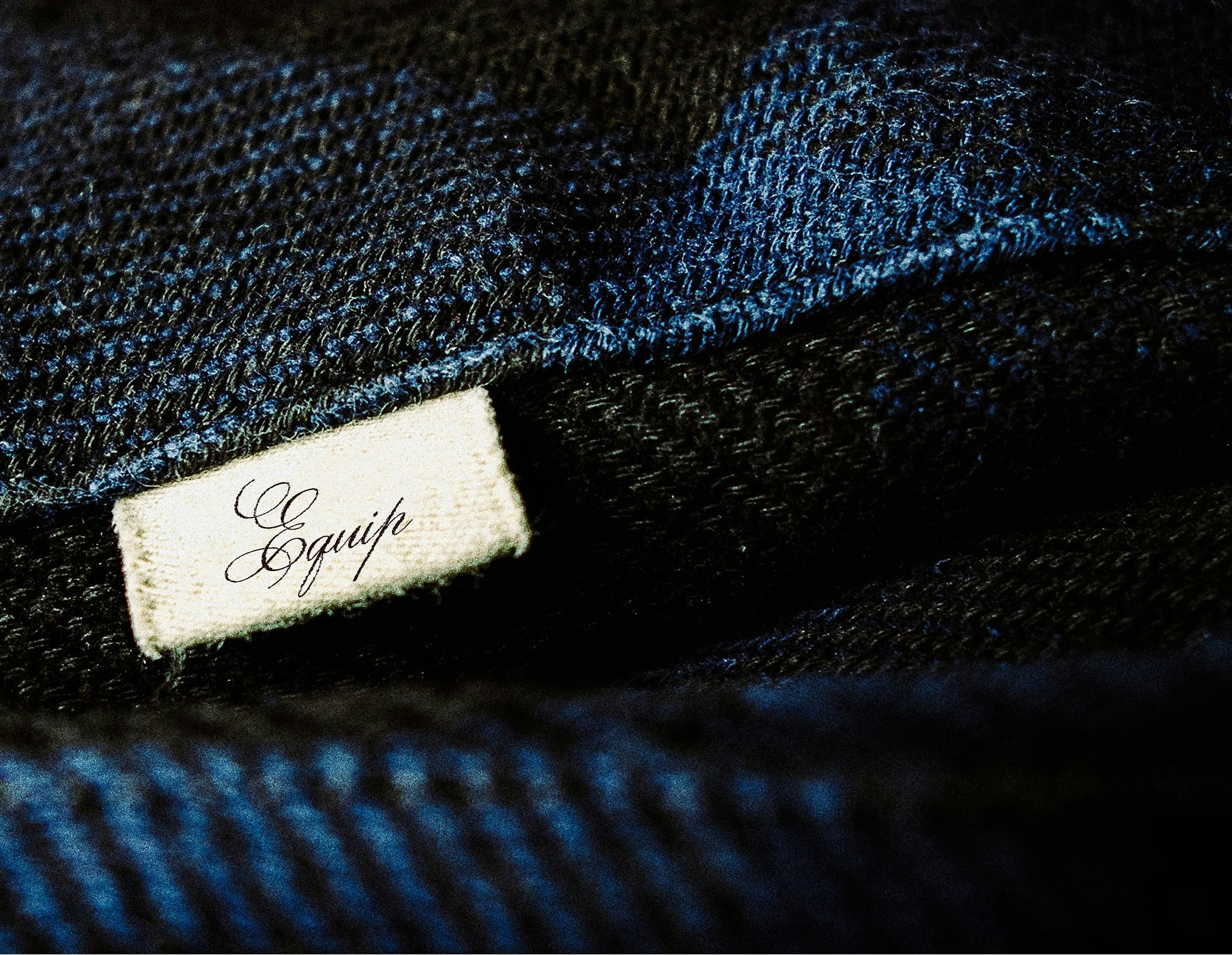
Complete brand identity for Equip, a Liverpool-based apparel label rooted in heritage-inspired streetwear and brought to life through authentic cultural storytelling. The project spanned brand strategy, logo design, typography, and cohesive brand guidelines.
Apparel
Fashion
Know More
Inspired by Liverpool’s 80s and 90s street culture and its understated confidence, this project explores the balance between heritage craftsmanship and modern refinement.
Made to Be Worn, Not Shown
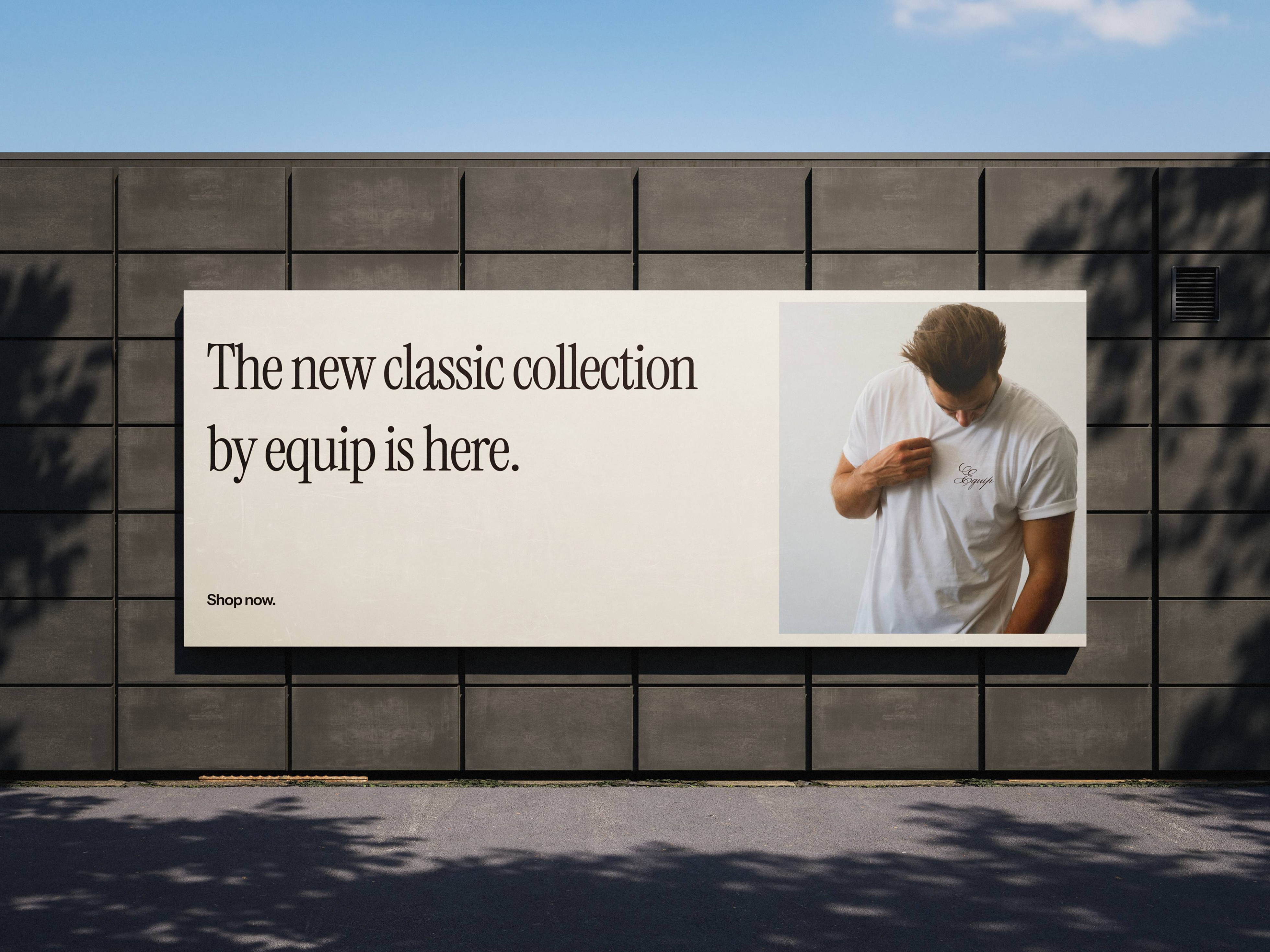
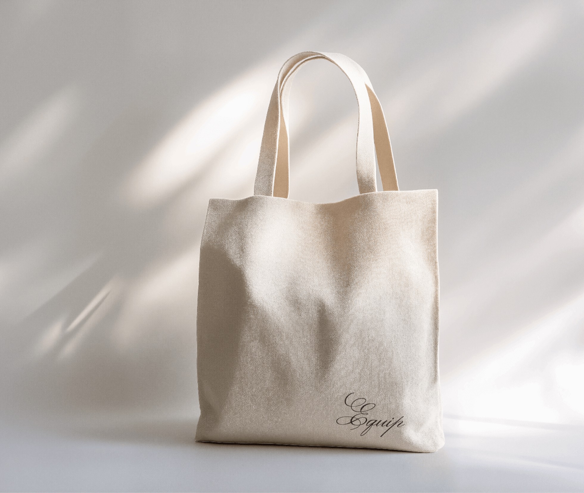
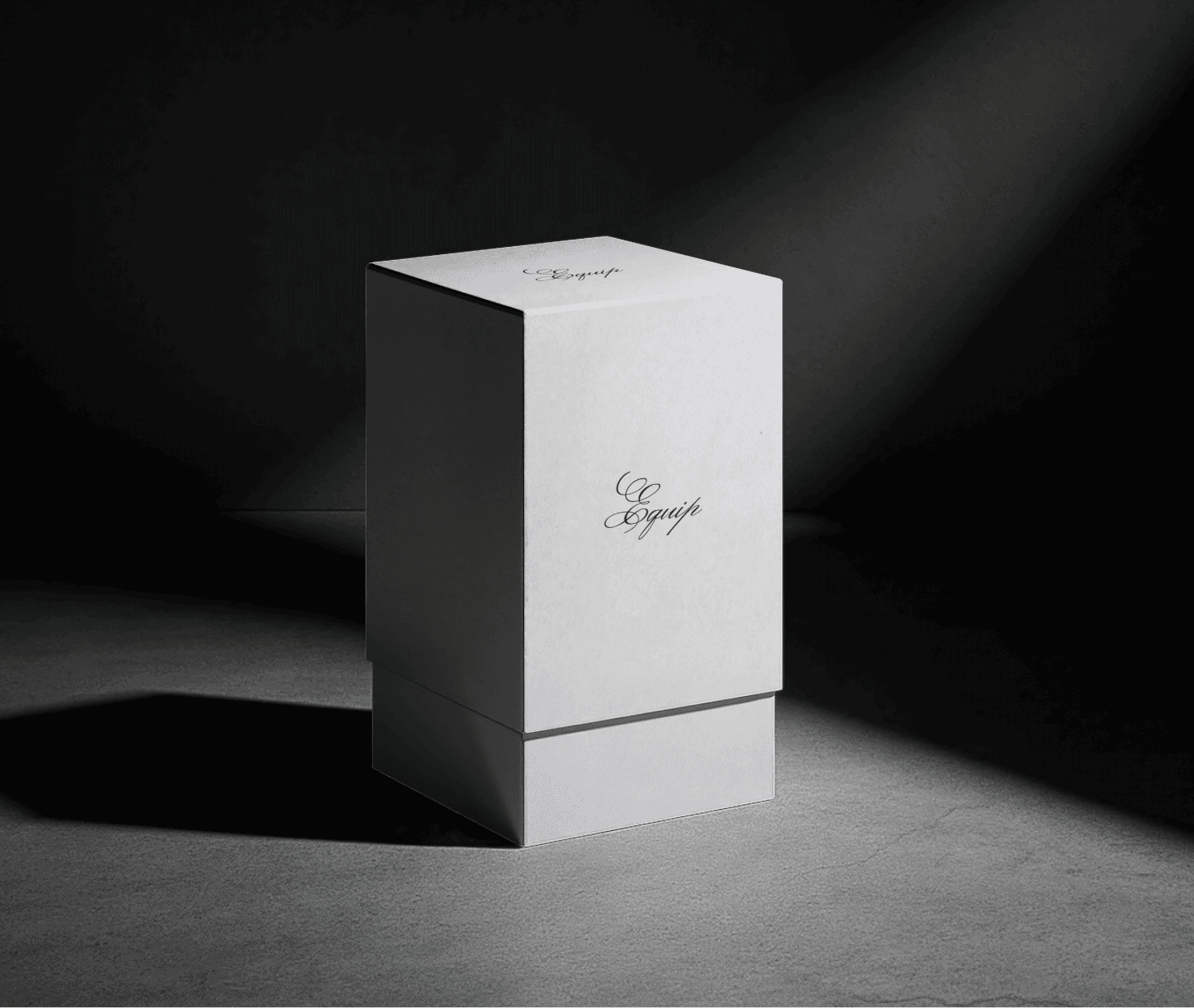
Inspired by the textures, fabrics, and cultural rhythm of Liverpool’s 80s and 90s, this project blends heritage driven visuals with a refined contemporary identity. The goal was to create a brand experience that feels both nostalgic and relevant, combining tactile cues, subtle detailing, and a warm, grounded color palette. From the expressive script logo to the understated emblem applications and thoughtful typography system, EQUIP is a celebration of craftsmanship and quiet confidence, designed to feel authentic and enduring.
Problem
Balancing vintage character with modern structure required thoughtful restraint and cultural sensitivity. The goal was to create an identity that feels authentic, tactile, and enduring.
In today’s fashion landscape, building a brand that feels timeless yet relevant is challenging. Many labels rely on loud logos and fast trends, often lacking depth and cultural grounding.
EQUIP was created as a response to this gap. Inspired by Liverpool’s 80s and 90s street culture, it centers on craftsmanship, texture, and subtle confidence.
Through a refined logo system, balanced typography, and a warm heritage palette, the identity feels intentional and grounded. It avoids excess and focuses on authenticity.
Rather than chasing attention, EQUIP communicates with quiet confidence. The garments and their story lead the experience.
Solution
EQUIP was created to move beyond loud, trend driven fashion by offering a refined and culturally rooted identity. It presents a timeless, thoughtfully crafted brand experience grounded in heritage and modern restraint.
EQUIP was envisioned as a thoughtful response to fashion that feels loud yet disconnected from cultural depth. Beyond aesthetics, the focus was on authenticity, material inspiration, and a cohesive identity that reflects heritage with clarity and restraint.
Every detail, from the expressive script logo to the emblem applications and carefully selected typography, was designed to feel intentional. The warm, old money inspired palette further reinforces a sense of timeless refinement.
Rather than relying on bold branding to demand attention, EQUIP communicates through quiet confidence and craftsmanship. It is a brand built to endure, not to chase trends.
Concept
EQUIP is built for individuals who value heritage, craftsmanship, and understated confidence. With refined design and a tactile visual language, the brand stands out through authenticity rather than excess.
A fashion brand is more than a collection of garments. It is an identity, a point of view, and a reflection of the culture it draws from. EQUIP was created to ensure that first impression feels intentional, rooted, and enduring.
Rather than relying on bold branding, the identity leans into subtle confidence and material authenticity. The expressive script logo, supporting emblem, and balanced typography system work together to reflect both heritage and modern refinement.
Beyond visual appeal, cohesion was central to the process. From color palette to tone of voice, every element was designed to create a seamless and immersive brand experience that feels tactile, honest, and built to last.
More Works

FAQ
01
What services do you offer?
02
What is your design process like?
03
How long does a project usually take?
04
Do you only design, or do you also develop?
05
What industries do you work with?
06
What do you need from me to get started?
07
Do you offer revisions?
08
How do payments work?
2022
Equip
Complete brand identity for Equip, a Liverpool-based apparel label rooted in heritage-inspired streetwear and brought to life through authentic cultural storytelling. The project spanned brand strategy, logo design, typography, and cohesive brand guidelines.
Apparel
Fashion
Know More
Inspired by Liverpool’s 80s and 90s street culture and its understated confidence, this project explores the balance between heritage craftsmanship and modern refinement.
Made to Be Worn, Not Shown
Inspired by the textures, fabrics, and cultural rhythm of Liverpool’s 80s and 90s, this project blends heritage driven visuals with a refined contemporary identity. The goal was to create a brand experience that feels both nostalgic and relevant, combining tactile cues, subtle detailing, and a warm, grounded color palette. From the expressive script logo to the understated emblem applications and thoughtful typography system, EQUIP is a celebration of craftsmanship and quiet confidence, designed to feel authentic and enduring.
Problem
Balancing vintage character with modern structure required thoughtful restraint and cultural sensitivity. The goal was to create an identity that feels authentic, tactile, and enduring.
In today’s fashion landscape, building a brand that feels timeless yet relevant is challenging. Many labels rely on loud logos and fast trends, often lacking depth and cultural grounding.
EQUIP was created as a response to this gap. Inspired by Liverpool’s 80s and 90s street culture, it centers on craftsmanship, texture, and subtle confidence.
Through a refined logo system, balanced typography, and a warm heritage palette, the identity feels intentional and grounded. It avoids excess and focuses on authenticity.
Rather than chasing attention, EQUIP communicates with quiet confidence. The garments and their story lead the experience.
Solution
EQUIP was created to move beyond loud, trend driven fashion by offering a refined and culturally rooted identity. It presents a timeless, thoughtfully crafted brand experience grounded in heritage and modern restraint.
EQUIP was envisioned as a thoughtful response to fashion that feels loud yet disconnected from cultural depth. Beyond aesthetics, the focus was on authenticity, material inspiration, and a cohesive identity that reflects heritage with clarity and restraint.
Every detail, from the expressive script logo to the emblem applications and carefully selected typography, was designed to feel intentional. The warm, old money inspired palette further reinforces a sense of timeless refinement.
Rather than relying on bold branding to demand attention, EQUIP communicates through quiet confidence and craftsmanship. It is a brand built to endure, not to chase trends.
Concept
EQUIP is built for individuals who value heritage, craftsmanship, and understated confidence. With refined design and a tactile visual language, the brand stands out through authenticity rather than excess.
A fashion brand is more than a collection of garments. It is an identity, a point of view, and a reflection of the culture it draws from. EQUIP was created to ensure that first impression feels intentional, rooted, and enduring.
Rather than relying on bold branding, the identity leans into subtle confidence and material authenticity. The expressive script logo, supporting emblem, and balanced typography system work together to reflect both heritage and modern refinement.
Beyond visual appeal, cohesion was central to the process. From color palette to tone of voice, every element was designed to create a seamless and immersive brand experience that feels tactile, honest, and built to last.
More Works
FAQ
What services do you offer?
What is your design process like?
How long does a project usually take?
Do you only design, or do you also develop?
What industries do you work with?
What do you need from me to get started?
Do you offer revisions?
How do payments work?